01Meet Tilt
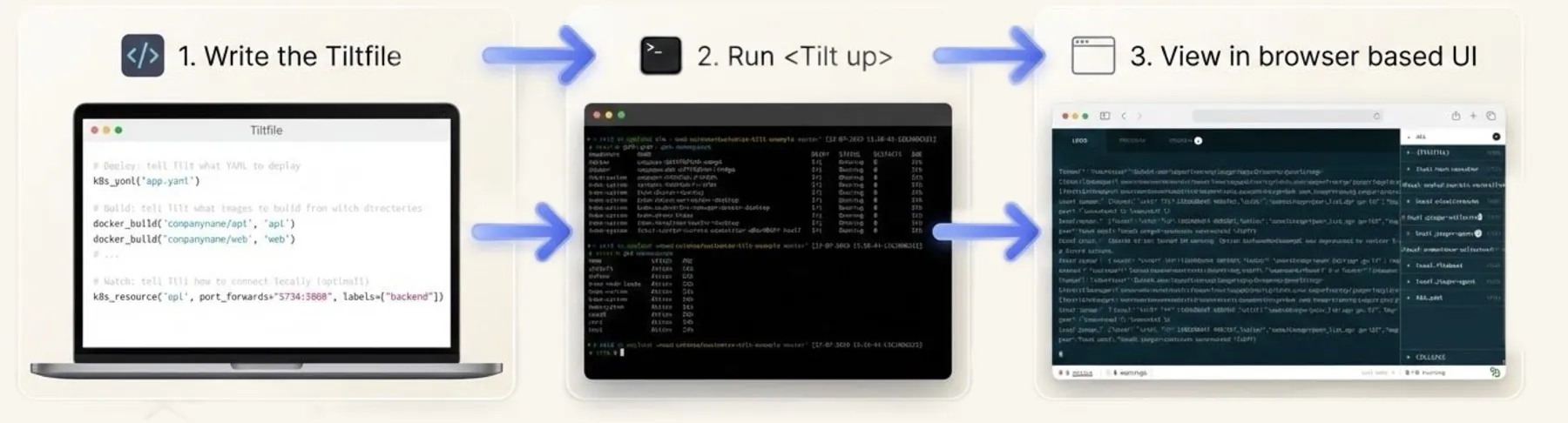
Write a Tiltfile, run tilt up, watch it live
Write a Tiltfile, run tilt up, and watch every service live. Teams with 100+ services live in it, and so do small focused teams.
Tilt is an open-source toolkit for fixing the pains of microservice development, on your laptop or in Kubernetes.
Cloud-native companies with 100+ services, and smaller teams with a few focused projects.
DevEx folks and engineering managers who write the Tiltfile, and the app developers who live in it.
02The toolbox, rewound
Start from the toolbox developers can't live without
We couldn't build every widget users wanted. So I rewound the vision to a clear overview, designed with empty seats for what came next.
How might we create an extensible UI that gives Tilt users an overview of the health of their services, and lets them customize it to their needs, so that Tilt becomes an indispensable part of their toolbox?
We couldn't build every widget users would want. So I rewound the vision to what we could ship first, a clear overview, and designed it with empty seats for the future.
- Jan 2021See health at a glance
- Jun – Aug 2021Buttons and groups
- Jan – May 2022Bulk actions, cluster status
- ★ North starA UI users shape themselves
The goal of Tilt: make it easier to focus on, examine and troubleshoot the services running in your environment.
03Research
Busy teams and curious hackers
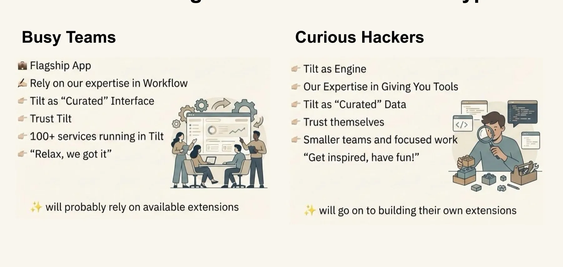
Two kinds of users: busy teams who trust what we ship, and curious hackers who build their own.
I listened everywhere: 1:1 research, Slack, bug reports, feature requests, Twitter, weekly client meetings, the roadmap, our async ideas board and hack week. Two archetypes stood out, and both pointed to an extensible UI.
"Relax, we got it"
A flagship app with 100+ services. They trust Tilt as a curated interface. They'll use the extensions we ship.
"Get inspired, have fun!"
Smaller teams doing focused work. Tilt is their engine. They'll build their own extensions.
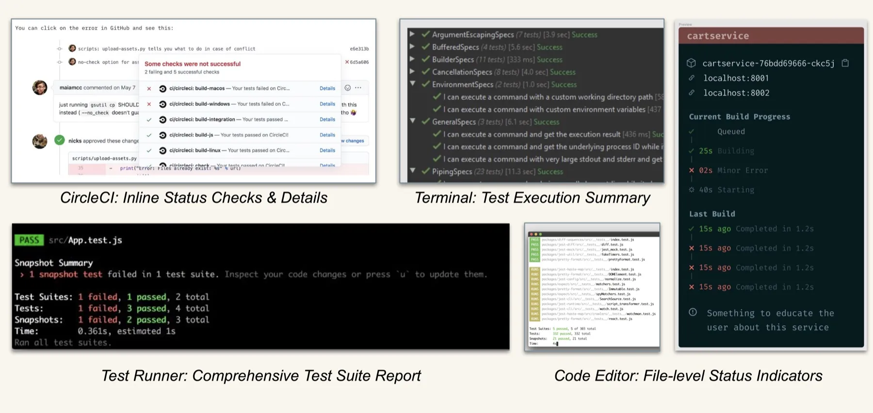
See the archetypes, and what users told us
- Blockers: Tilt didn't work well with multiple clusters, the web UI got CPU-intensive with lots of local services, and multiplexed "All Resources" logs became unusable.
- UX frustrations: Tilt got lost among browser tabs, and the log filtering controls had issues.
- Mental model: some users didn't trust Tilt to build and deploy automatically, and wanted more control.
04Ideation
Which layout can keep growing?
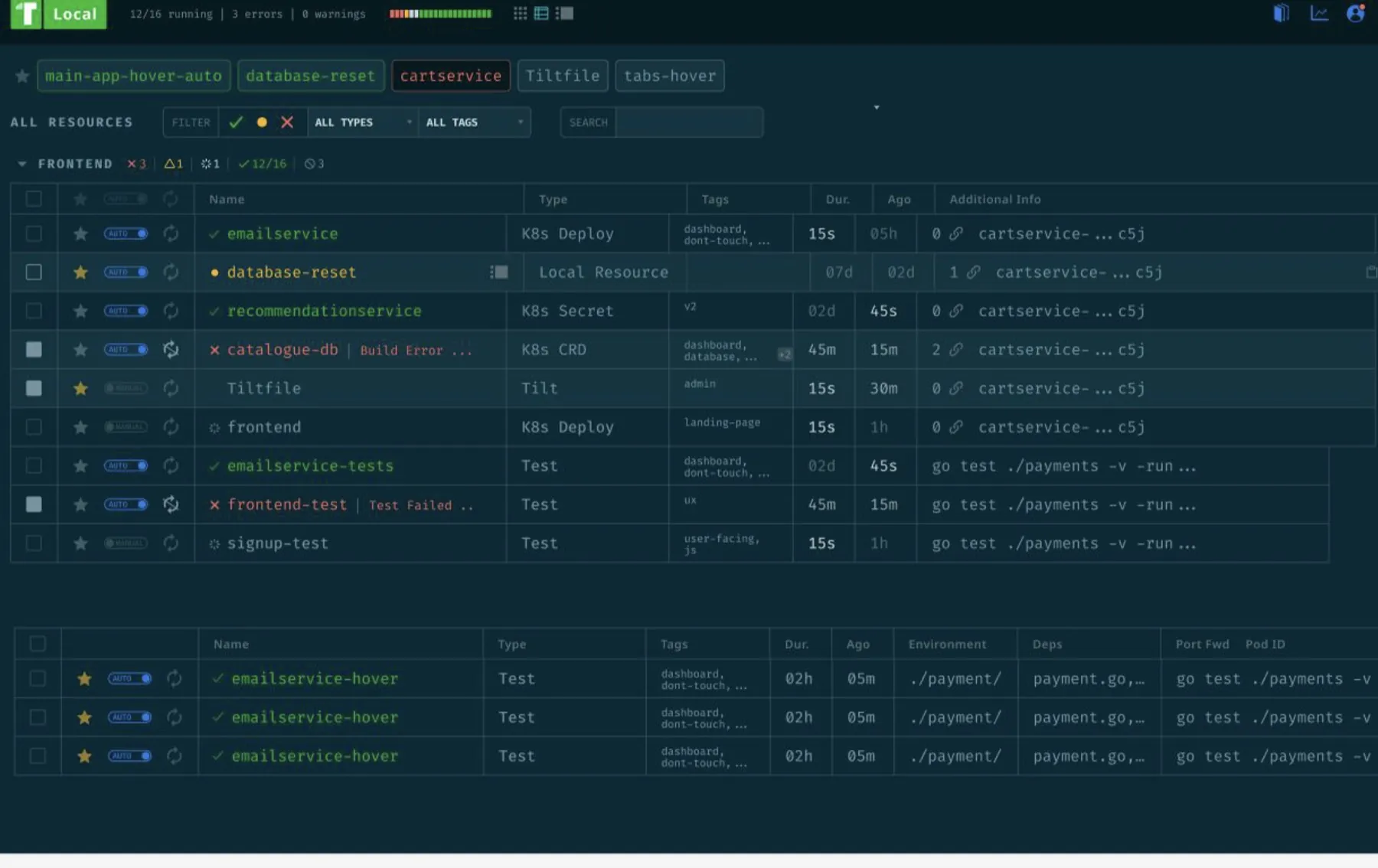
I tested three layouts with users. The table won: every new idea can become a column.
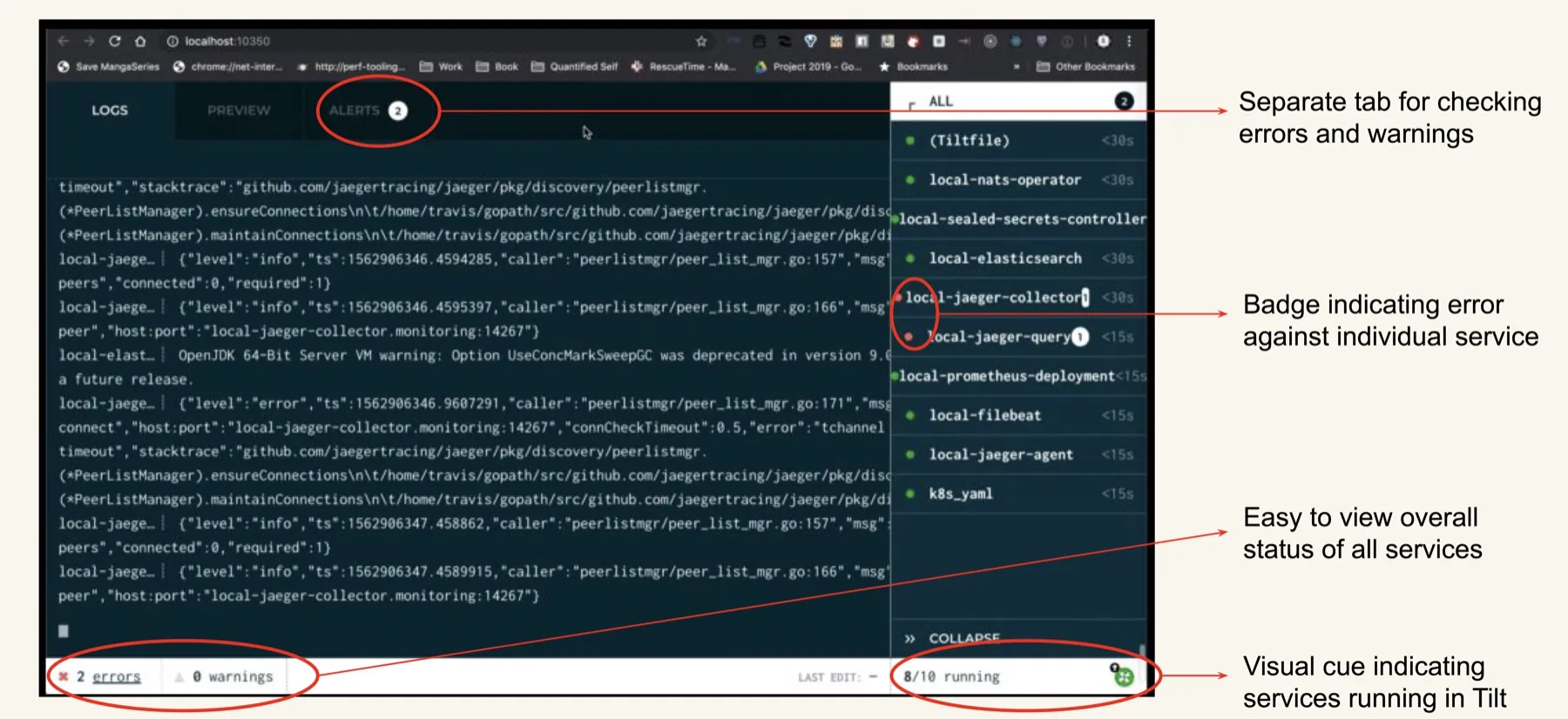
Before, Tilt was a list of services and logs, with errors on a separate tab. I tested three new structures with users, judging each by one question: will it still work when we add things we haven't thought of yet?
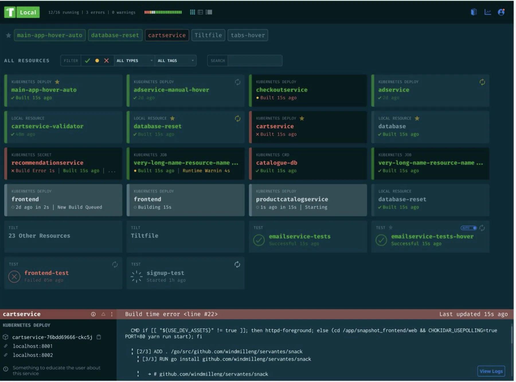
1Grid of cards
+ Loved the status bar and filters. − Accessibility issues, poor use of space for 100s of services, not extensible.
2Split with tabs
+ Loved pinned services. − Still a long list, noisy while coding, no filtering.
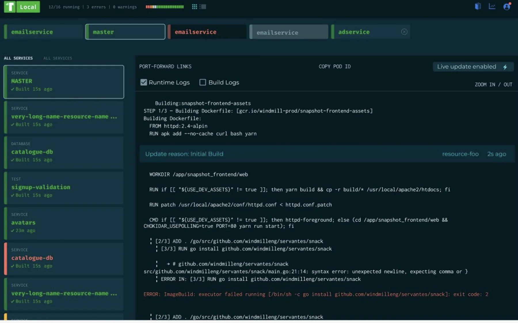
3Table we picked this
+ Easy to parse, better use of space, and it "feels more extensible": every new idea can become a column. − Needed build vs runtime errors.
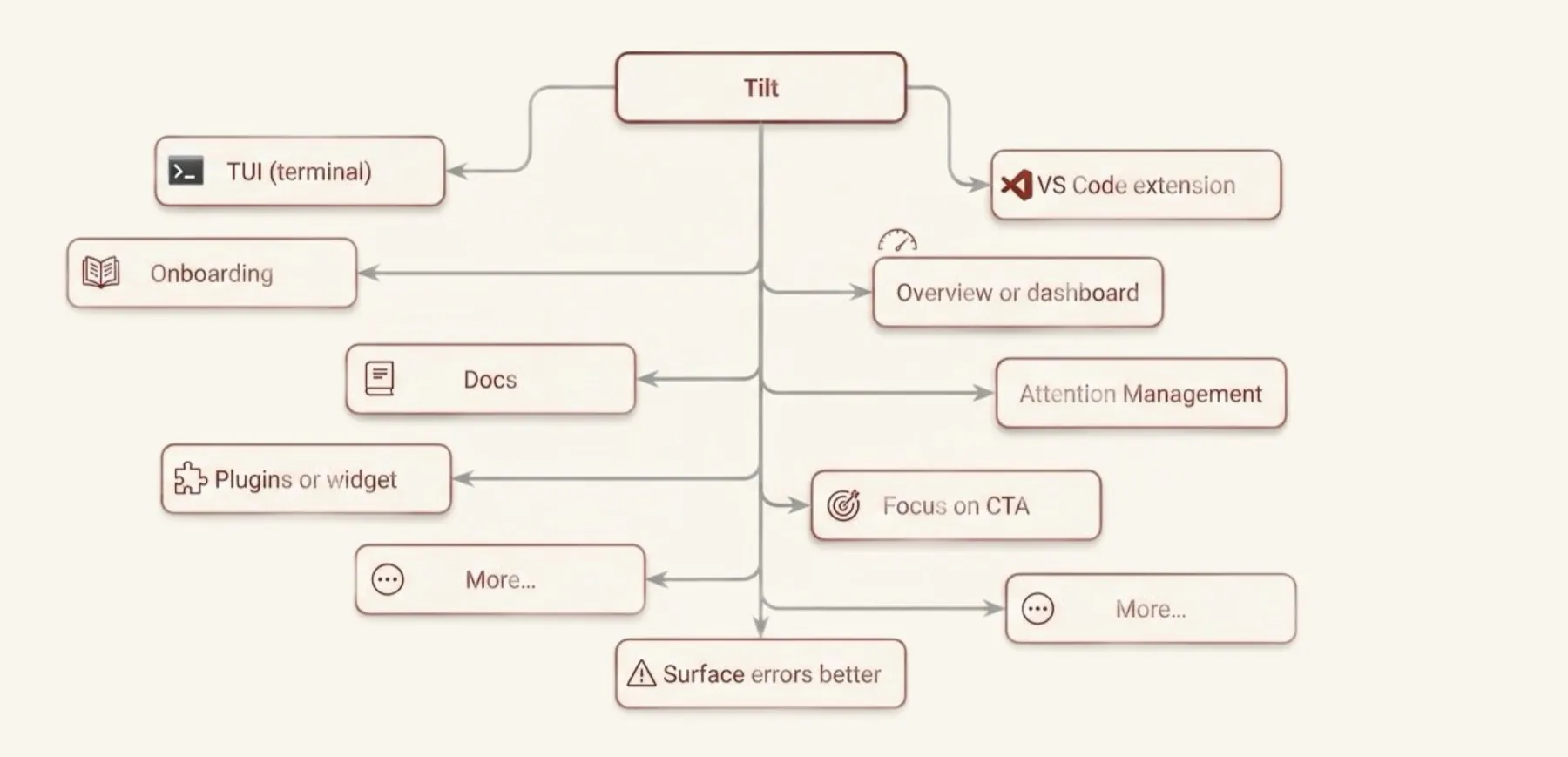
See the UI before, the opportunity map and industry research
05Final design
Two views, with empty seats for the future
Two views, each with room saved for the future.
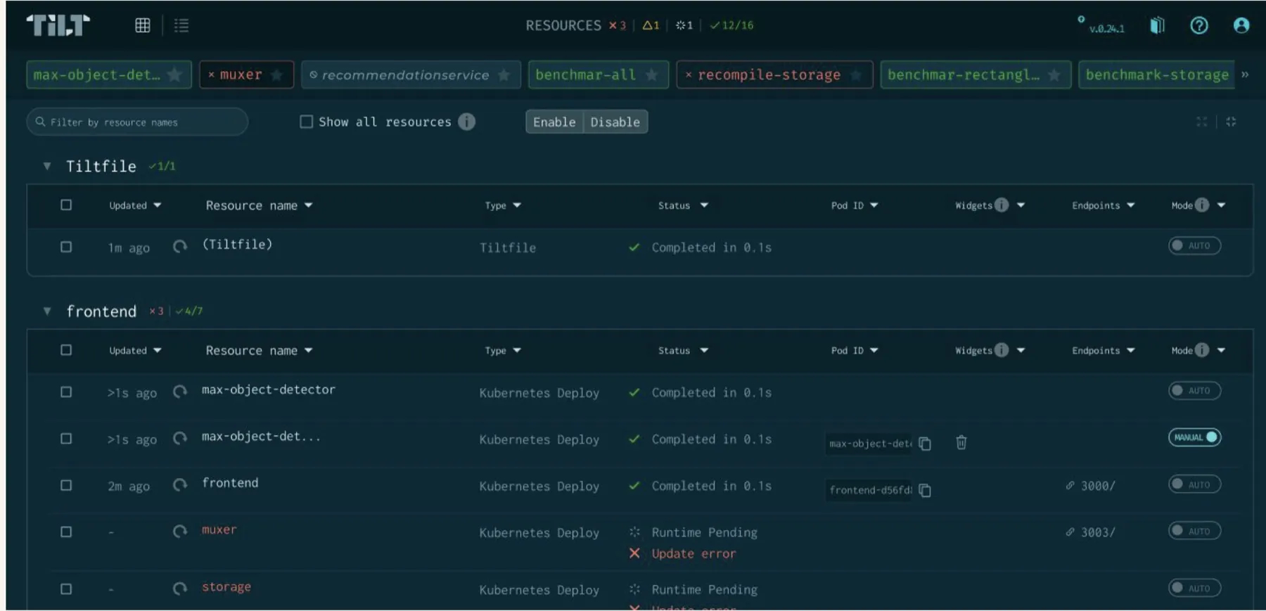
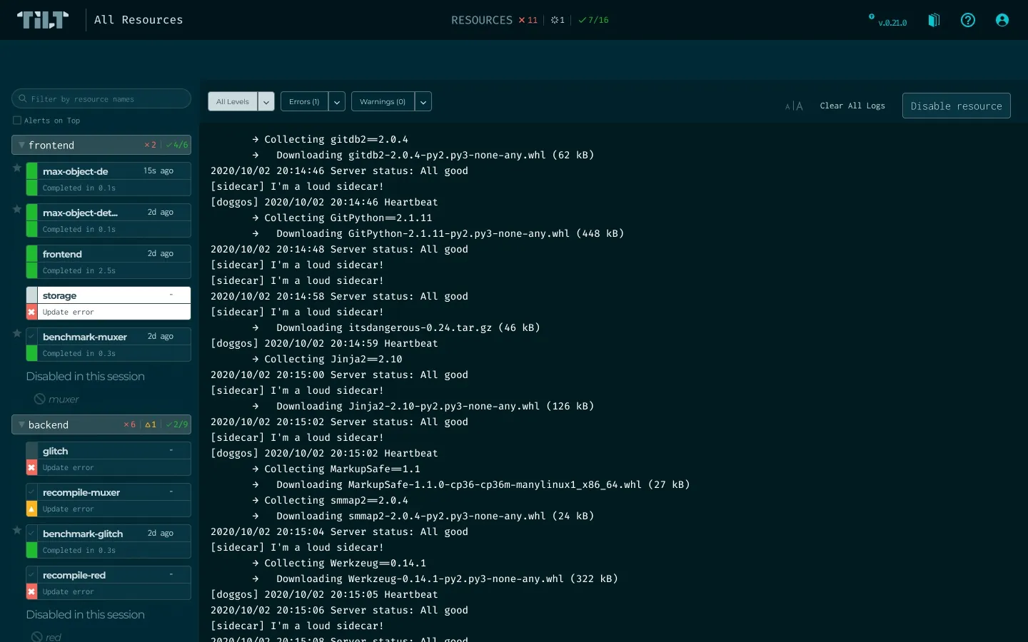
- Overall status barErrors, warnings, pending and healthy counts, always in view
- Pinned resourcesThe services you care about, one click away in both views
- Status by typeBuild and runtime states, told apart at a glance
- See what you wantA persistent filter, alerts on top, collapsible groups
- Consistent across viewsFilters and pins persist between the table and the sidebar
- Small but mightyThe favicon changes on a new error; sort and hide columns
06Built for the future
The seats filled up, one by one
Over the next year, new features moved into the seats the design kept open.
My handoff listed the spaces the design kept open. Tilt's public blog and docs show what moved into each one.
| Room I left (2021) | What filled it, in public |
|---|---|
| The table grows by columns, for new widgets | Custom buttons on resources, Jun 2021: "the first step towards enhanced Tilt dashboard customization." Tilt blog ↗ |
| Collapse or expand groups | Resource grouping by labels, Aug 2021, in v0.22.2. Tilt blog ↗ |
| Space for global info, like cluster status or Tilt updates | Navbar buttons, Jul 2021, and cluster connection status in the navbar, May 2022. Buttons ↗ Cluster status ↗ |
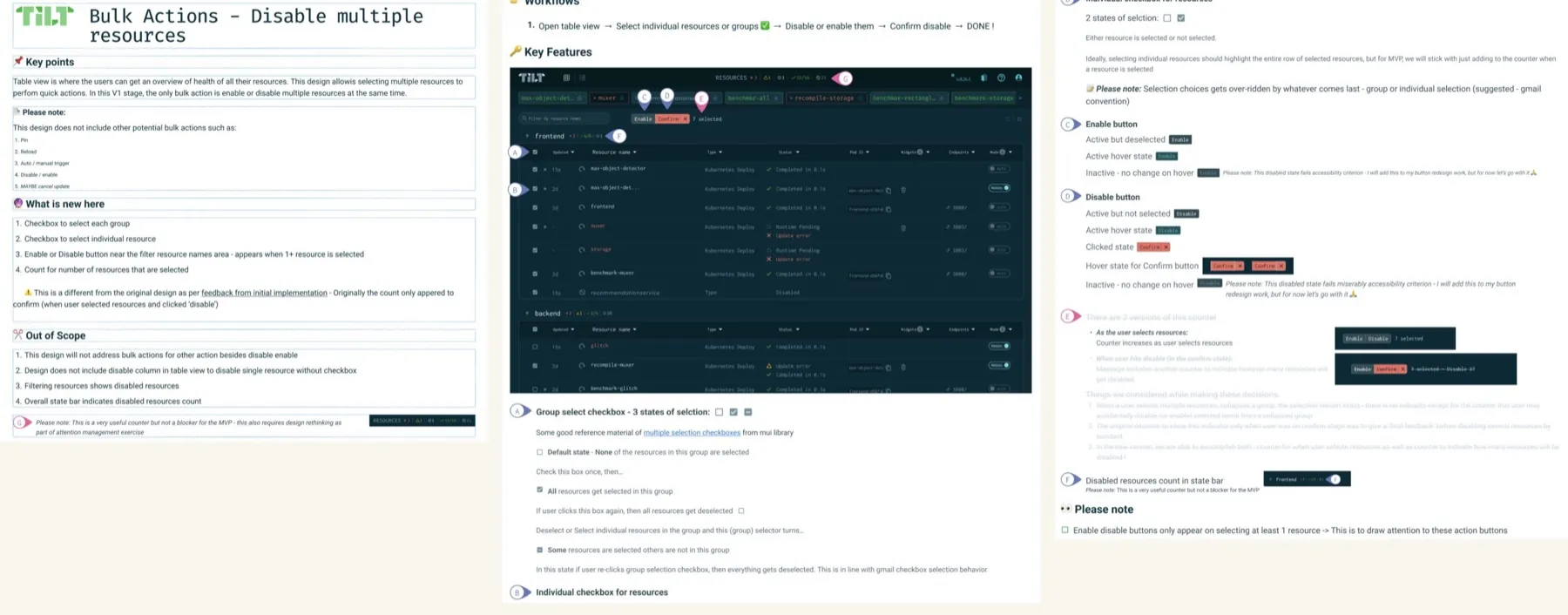
| Checkboxes ready for bulk actions like disable, enable or reload | Bulk enable and disable in the table view, Jan 2022: "bulk action buttons will appear when any resource is selected." Tilt docs ↗ That's the Button Story → |
Engineers built these features. My part was making sure the UI already had a place for them.
07Try it yourself
Fast-forward the dashboard
Start in January 2021 and step forward in time. Watch each new feature drop into the seat that was saved for it.
| Select | Resource name | Status | Widgets |
|---|
A playful sketch, not the real product. Dates and features come from Tilt's public blog and docs, linked above.
08Outcomes
Glows, grows, and what I'd do again
Users noticed right away, and the design became the baseline Tilt grew on.
- Wow, HUGE improvements in the UI between 0.18.4 and 0.18.10A Tilt user in Slack, after the new UI shipped in v0.18.6
- …it works great and I like the pin feature in the UI and that clear logs…A Tilt user in Slack
Extensible: add widgets or hide columns. Surfaces errors and warnings. Better attention management. Follows WCAG accessibility guidelines.
Punted: the detail view log redesign and error messages in a bottom drawer. Project switching wasn't solved here, until the Button Story.
The design earned praise from existing and new users and became the baseline for growth, built alongside onboarding, a docs revamp, the VS Code extension and cluster status. What I loved most: debating and iterating with opinionated teammates and users, and influencing an ever-shifting roadmap. If I did it again, I'd do it almost exactly the same, with more user research in the early iterations.
See a typical design handoff